Creating Custom Lower Thirds Tutorial

Adding text descriptions enriches your shows and videos; the graphic overlay at the bottom of your screen is called a lower third or captions. They are extremely versatile and can help to give your viewers relevant information to the story, help identify who is involved, or tell the location. Especially when presenting a story that switches from location to location, lower thirds can help your audience to transition smoothly from scene to scene. By simply adding the month or year to your video, the audience can stay current with the story. The main benefit of using lower thirds is to make your text/captions/photo descriptions stand out against the background of your photos and videos and give info without being overbearing or too obvious.
In this tutorial we will look at just how easy it is to create custom lower thirds in SlideShow 8. It is as easy as placing a graphic behind the text overlay, but with effects, motion, and sound you can do so much more…
Simply create your own – without the need for Photoshop Etc.
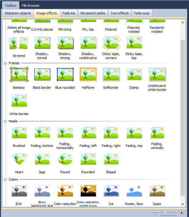
In SlideShow 8, you will find pre-made Lower Thirds that just need to be edited under “SlideShow objects” and then “captions”. With these you can combine fonts, backgrounds, use image effects, and add music. In the photo to the side you can see the background “baking paper”, which was changed and dyed in the internal image editor tool with the help of 2 image effects from the toolbox ( “Vignette” and “Fade Out” right).
To edit a pre-made Lower Third just:
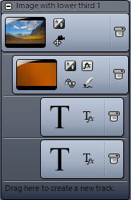
- Pull a chapter from the toolbox into the timeline, in which you can place your photo.

- Then select the background image for your text and drag it to the track under your photo.
- Then drag one of the pre-made captions below the background and image. Now you can adjust the size and positioning of the caption within the layout designer.
- Once it is the size and in the position that you want it, drag a text object from the toolbox to the track under the background and images.
- In the Layout Designer you place the text directly on top of your Lower Third and then select the desired font and size in the “Properties” window on the right.
- Once your font size and type are set your Lower Third is ready.
Personalize your look
After the basics, comes the freestyle. For example, the Lower Thirds can be made transparent by adjusting the transparency in the “Properties” window. You can change the color, sharpness, and more with the help of th e image editor tool. With the effects editor available in the Ultimate version, the customization possibilities are multiplied. Creating a cool effect is made even easier via the numerous ready-to-use picture effects in your Toolbox.
Font and colors
You want your text to stand out against your background, the best way to do this is by using fonts with subtle edges and staying away from thin (or ornate) fonts. Helvetica (a favorite font of designers) goes nicely in videos and using white text with shadows is a classic.
Tip: For web videos solid backgrounds are good because they can easily be compressed and will not get blocky during play back.
Motion
By adding entrance and exit motion to your Lower Thirds, your audience’s attention will be drawn just long enough to read the text, without distracting from your images.
Sound
Once you’ve got the basics down you can look into adding sound to create an impactful entry and exit for your lower third. Adding a swoosh when a title flies in or the sound of pencil scratching on paper when there is a handwriting like text animation, can add to the drama of your video and build upon the theme. There are endless possibilities to combine motion, text, and sound and create a single lower third.
A few extra tips and uses for Lower Thirds:
* Company colors and logos used with lower thirds can help with consistent branding efforts.
* They are a great place to include company contact info
* The song title, artist, album for musical accompaniment looks professional when shown (as/on) a Lower Third
* Lower Thirds should only stay on the screen long enough for your audience to read it, when a lower third stays on the screen for too long the audience may get distracted from the content of your video.
* The general rule with Lower Thirds is that “less is more”, so keep them simple and less distracting
Theory is nice, but practice is better
So to get you started we’ve created a sample video and a free template for you.
As always the template can be downloaded for free from our download center. Don’t forget that you can make adjustments to the pre-made Lower Thirds already within SlideShow 8 and then save them as your own templates by dragging them into the Toolbox.
Template available at: http://www.aquasoft.net/Downloadcenter_en.as?spd=418


